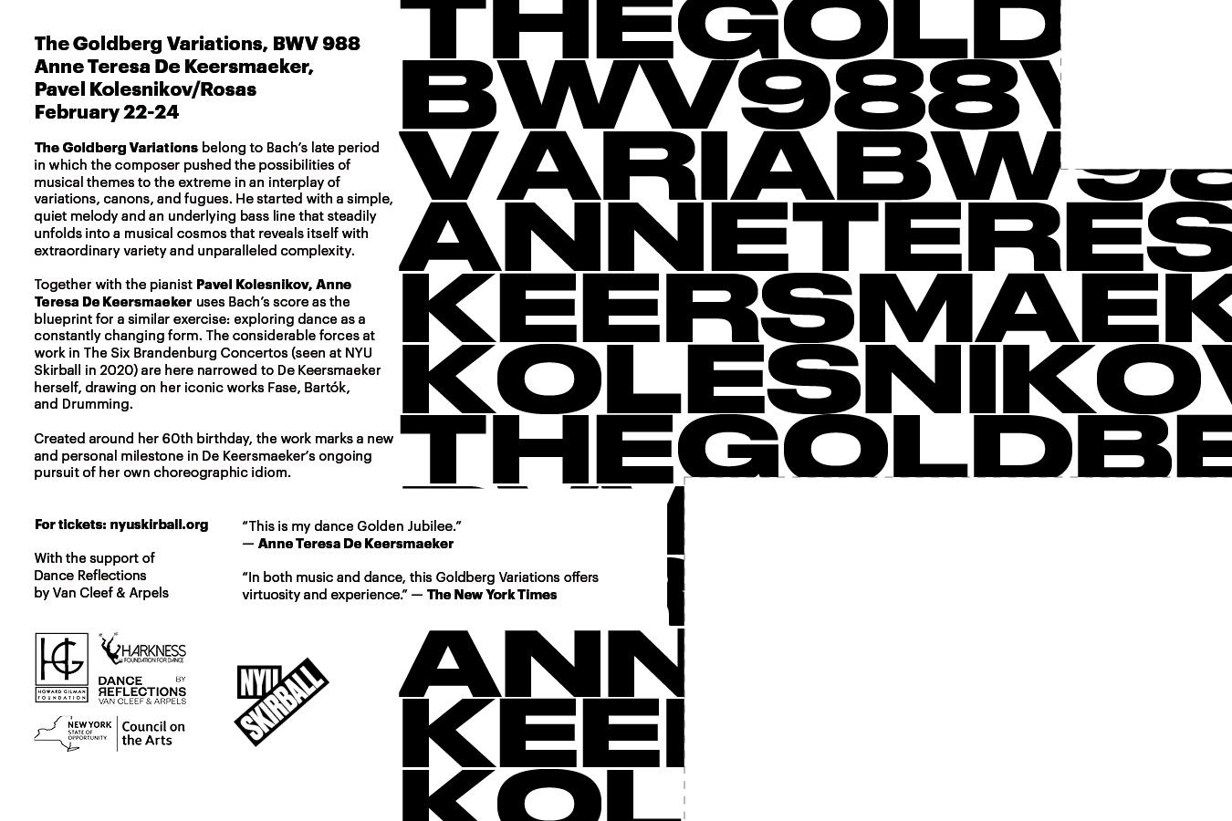
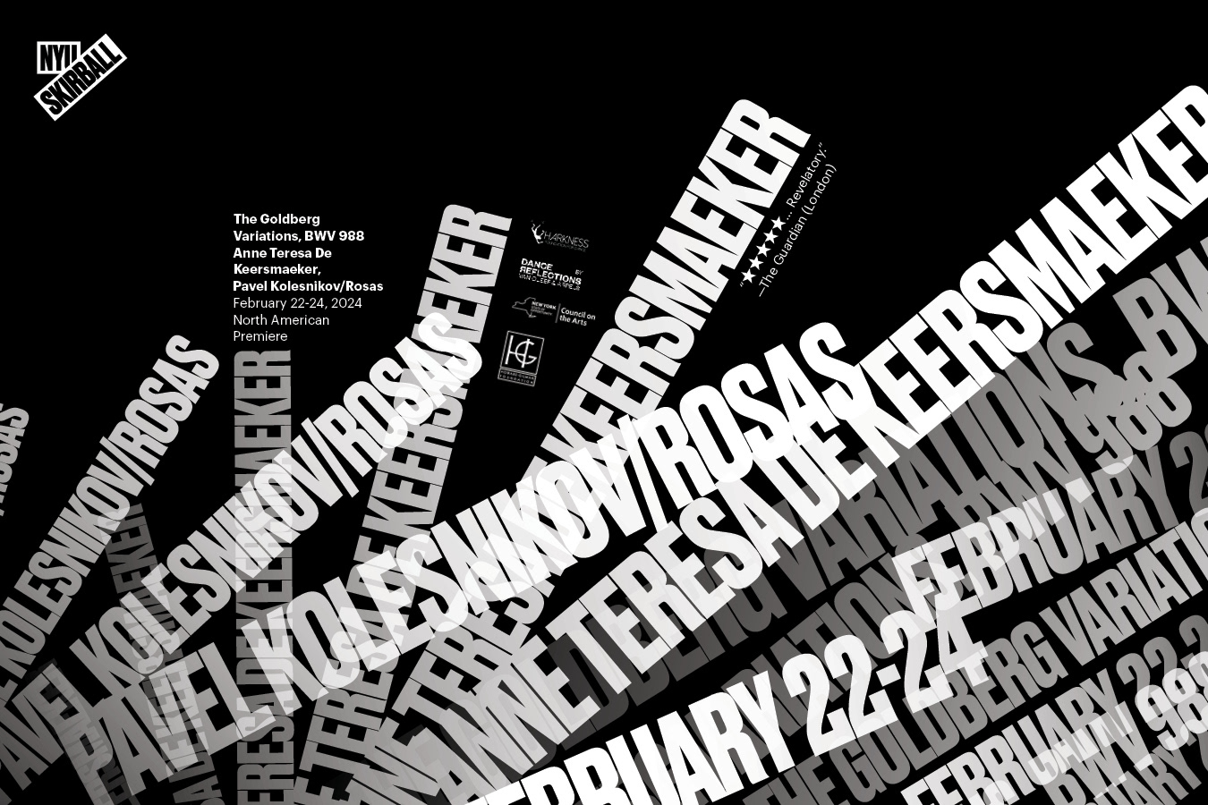
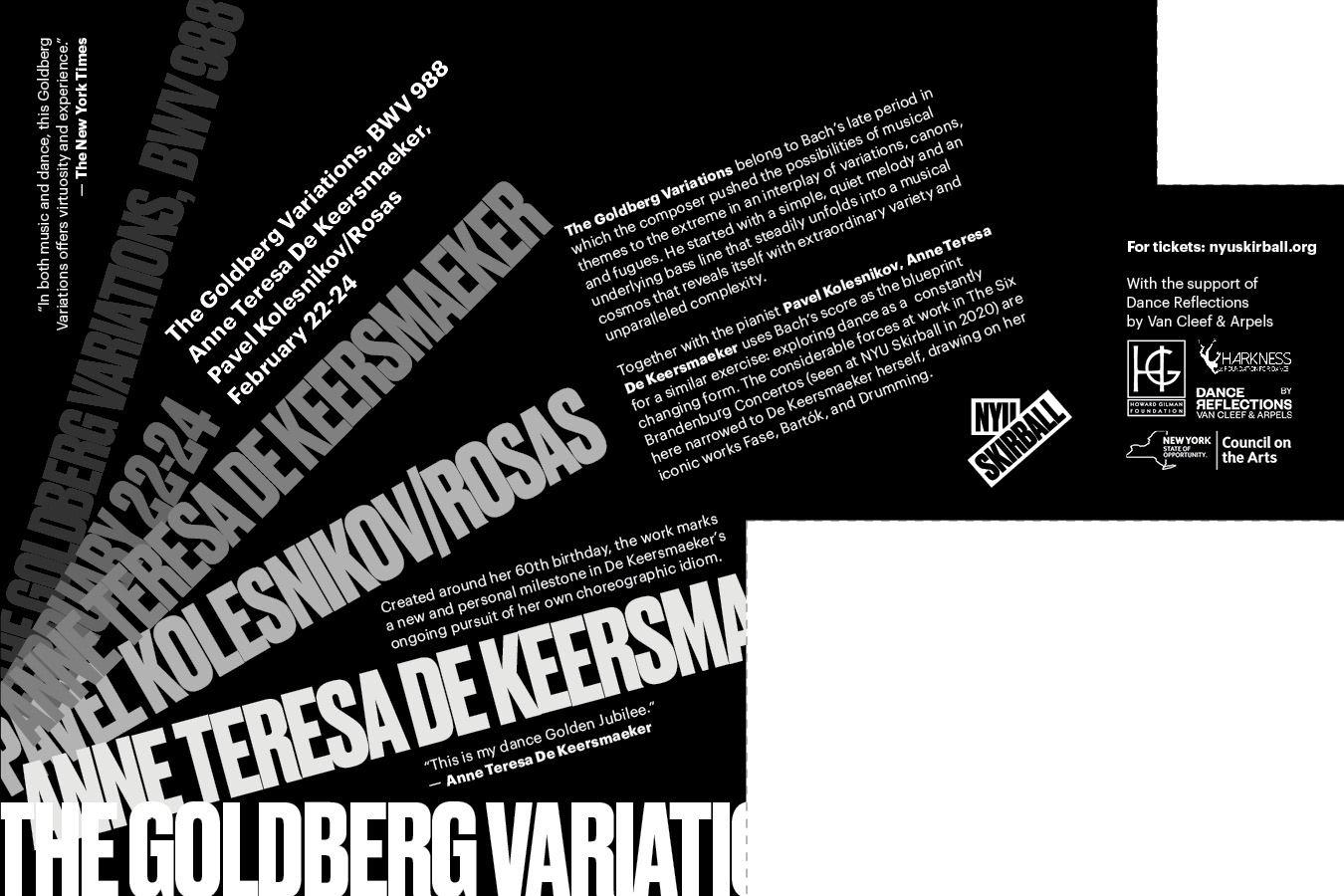
For every 9x6 inches postcard, my primary objective was to uphold brand consistency, thereby reinforcing the distinct identity of NYU Skirball. The utilization of the commanding fonts Druk or Druk Wide for headlines introduced a bold and attention-grabbing element, while Graphik, chosen for supporting copy, contributed to a clean and contemporary aesthetic. This careful typographic selection not only ensured readability but also maintained coherence with the overarching brand.
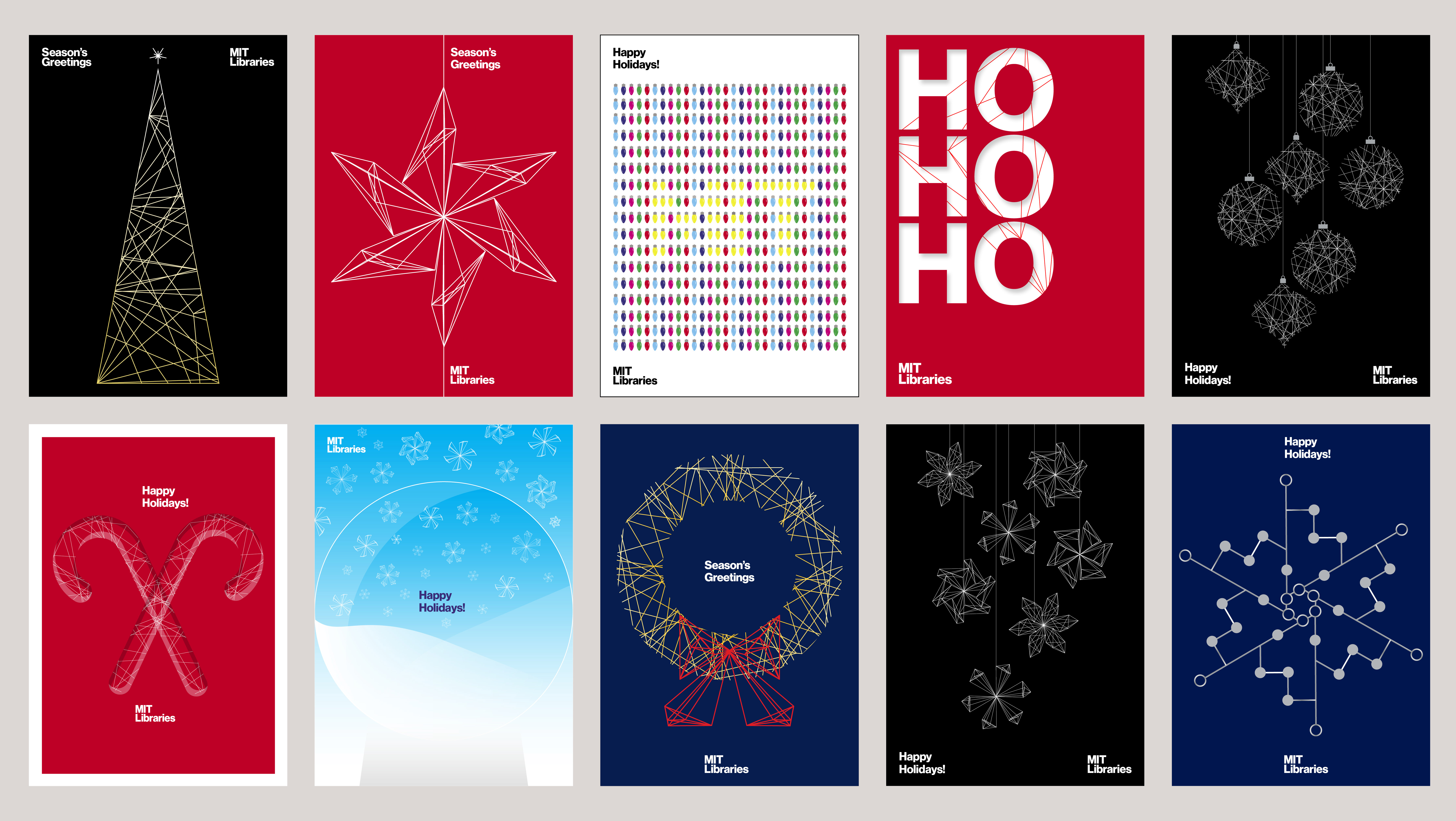
By capitalizing on unique designs for each postcard, I aimed to facilitate effective visual storytelling. Whether through thoughtfully chosen color schemes, captivating imagery, or meticulous layout arrangements, each postcard successfully communicated the mood and essence of the respective performance. This approach elevated the overall engagement level, transforming the postcards into compelling visual narratives for the audience.